

Breedon website
re-design proposal
THE BRIEF
Breedon is a leading construction materials group in the UK producing cement, aggregates, asphalt and a range of surfacing solutions. Breedon approached Nelson Bostock to pitch a new concept for their website, proposed strategy, and fees.
THE GOAL
The goal was to deliver to deliver a winning presentation outlining key pain points across SEO, dev, UX and content on the existing site. We identified the following elements as the top 4 aims of the site:
Better reflect the company’s position
Allowing Breedon to stand out from their competitors
Enable visitors to access and consume content efficiently and contact them easily
Quick, easy and cost-effective to manage


PROCESS AND CHALLENGES
The initial stage was researching Breedon as a business, identifying stakeholders groups alongside researching key competitors and identifying aspects they do well and don’t don’t deliver well in. One of the biggest challenges as part of the pitch was to deliver initial solutions for the many independent websites Breedon has gained for various product and services in Ireland and Northern Ireland. In total there are 13 websites across England and Ireland. Another request was to present ideas on how to incorporate their new sustainability product range into the new site.
USER GROUPS


SITEMAP PRINCIPLES
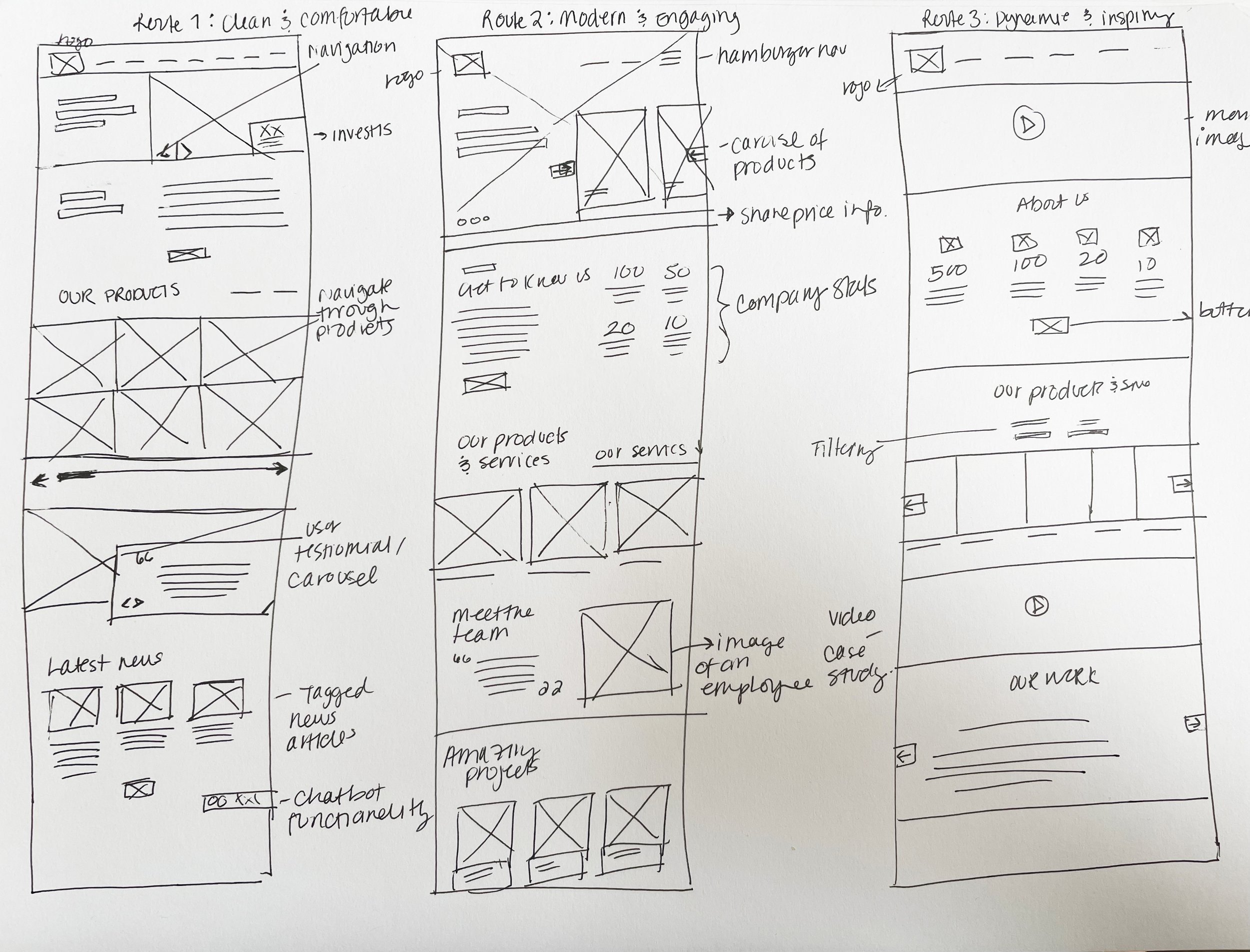
1. Better structure aids navigation
2. Make content easier to find
3. Better use of secondary pages

LO-FI HOMEPAGE WIREFRAMES
UI APPROACH
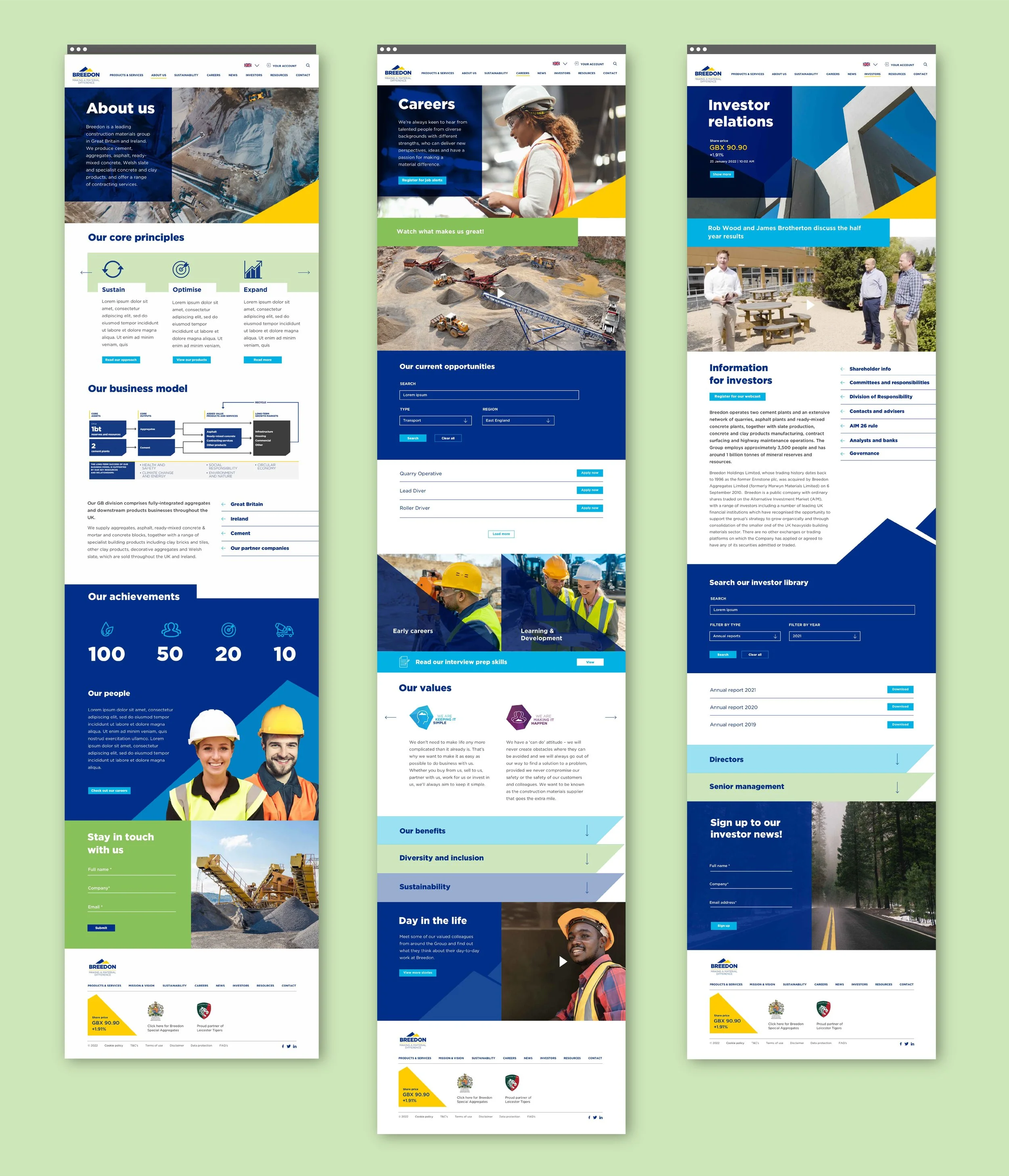
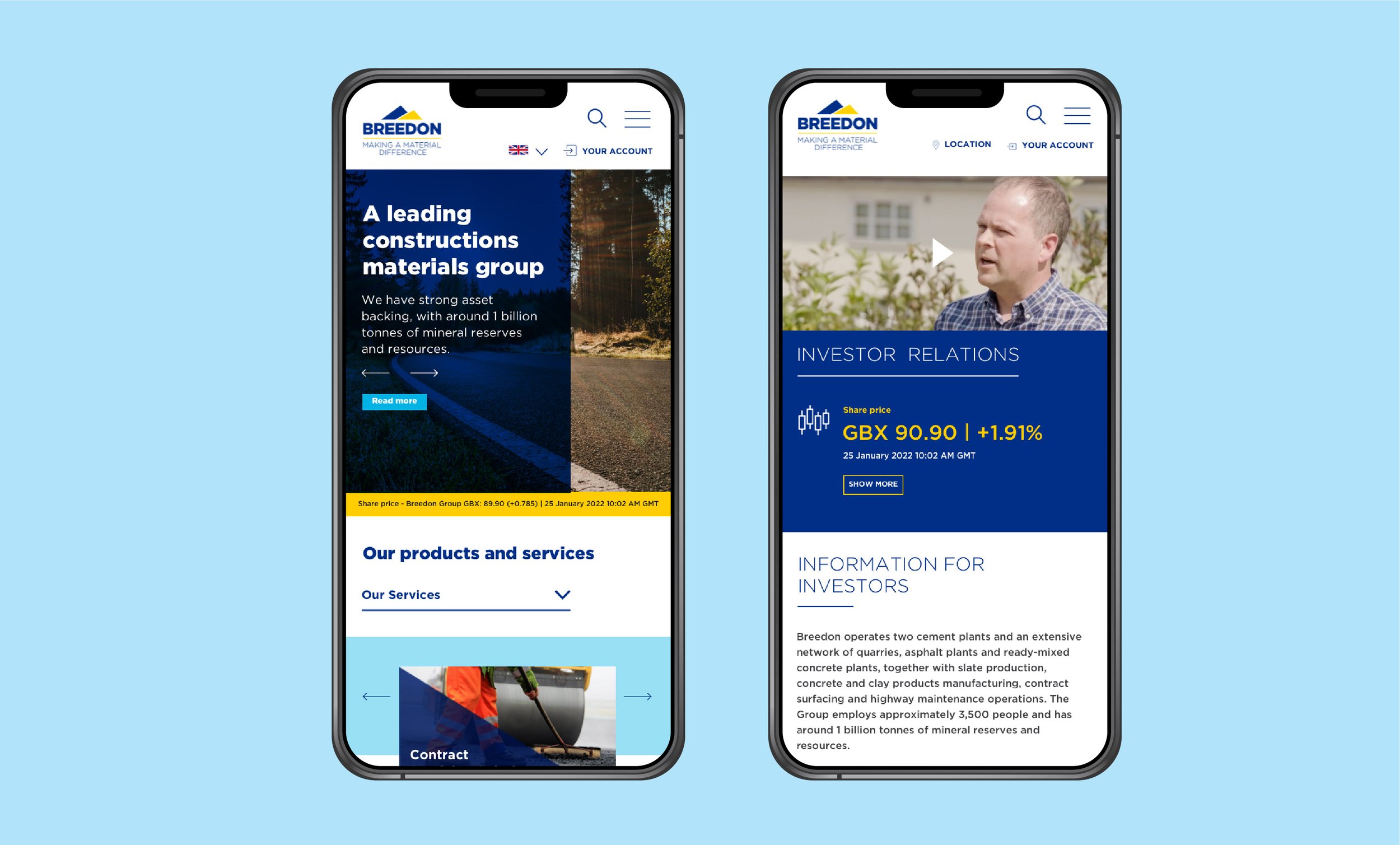
For the first round of the pitch I presented 3x design routes for homepage ranging from safe to bold. The client liked creatives routes and the pitch they asked us to build out the bold approach further and asked us to pitch on-site in front of the CFO and marketing team.
For the second round of the pitch I adapted the chosen homepage design based off initial client feedback and presented UI visuals for the inventors and careers pages which the client requested due to importance.
DESIGN PRINCIPLES
Clear content structure
Visual & engaging CTAs
Personable approach
Micro-interactions to liven up the pages
UI APPROACH
For the first round of the pitch I presented 3x design routes for homepage, ranging from a safe to bold approach. The client liked the creatives routes and our pitch so much that we were invited to pitch on-site in front of the CFO.
For the second round of the pitch I adapted the chosen homepage design based off initial client feedback and showed UI visuals for the inventors and careers page which the client requested due to the importance.
SEO APPROACH

PERFORMANCE DASHBOARD
