

Nelson Bostock Unlimited website redesign
THE BRIEF
Nelson Bostock Unlimited is an integrated B2B PR agency for tech brands. The agency had recently re-branded it’s look and feel and proposition and the old website required an overhaul to correspond with the new branding.
CHALLENGES
Developing a structure that captures NBU’s capabilities and offering in a coherent visual design.
PAIN POINTS:
A simple landing page design with content split across various case studies down the page
No actual client case studies just a logo grid
No engaging UI elements on the page
Content - lacking strong CTA’s and key messaging throughout
Lack of evidence of company culture
No clear cut user journey
No on-page content strategy
Not responsive
PROCESS AND EXPERIENCE
I pulled together a revised sitemap for a full scale website that reflected the agency’s offering. This included a clear emphasis on the offering and case studies split into services and sectors pages. A news & blog page with search, tagging and archive functionality was included to promote weekly written content.
Revised sitemap
INITIAL WIREFRAMES
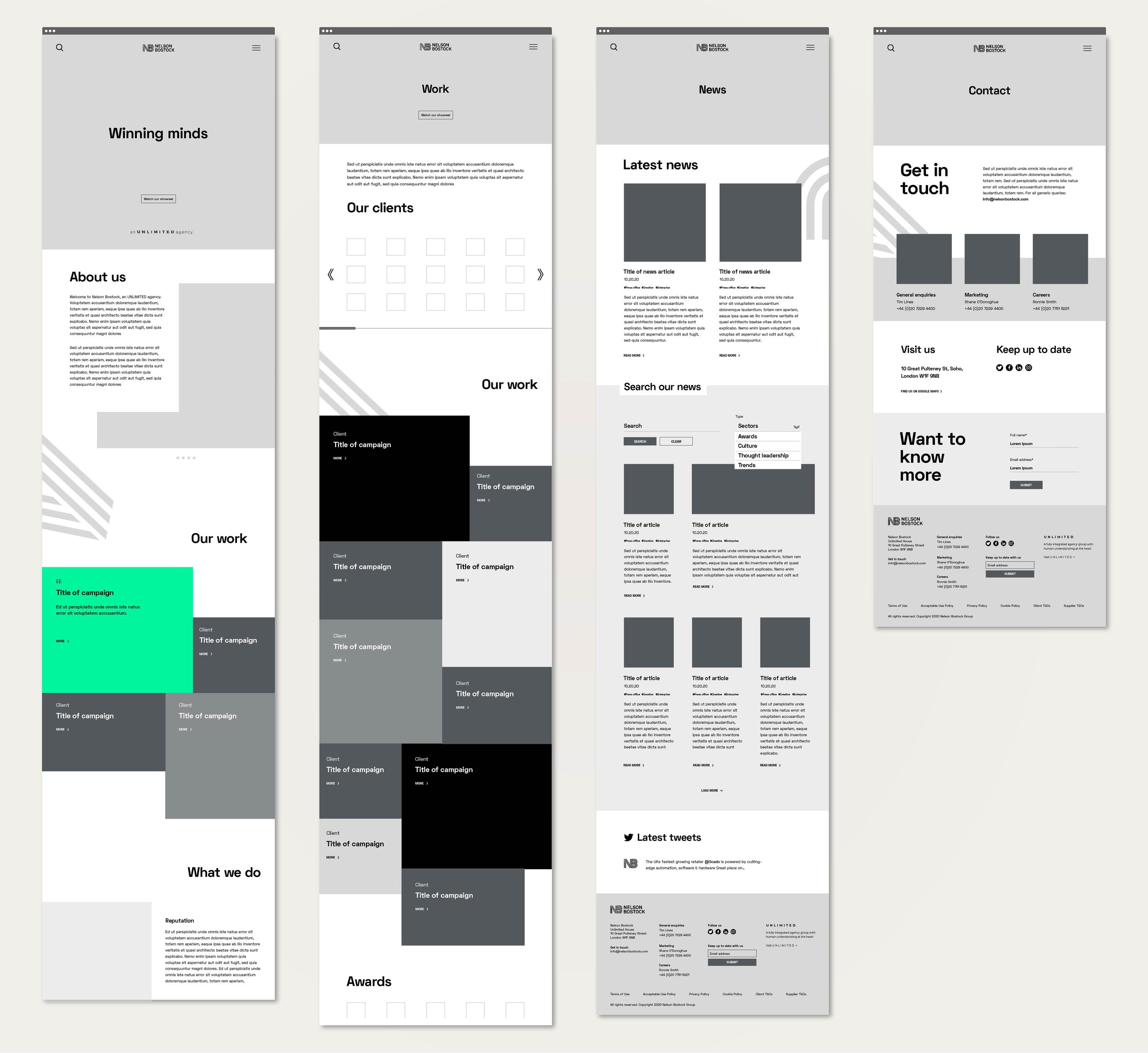
UI DESIGN
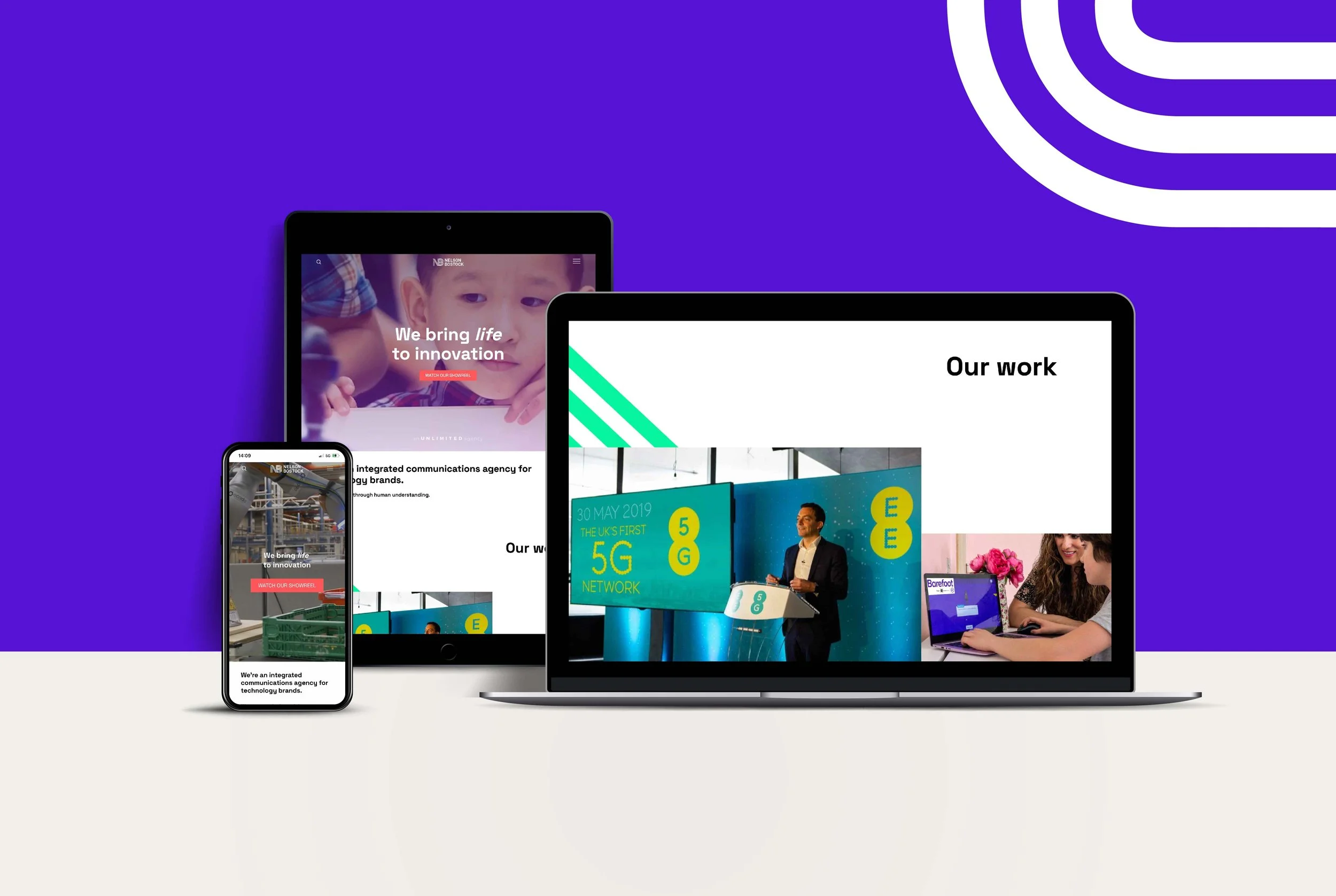
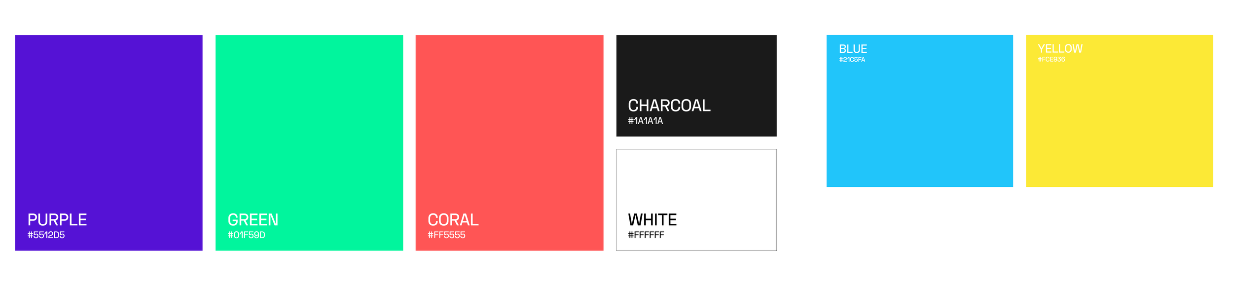
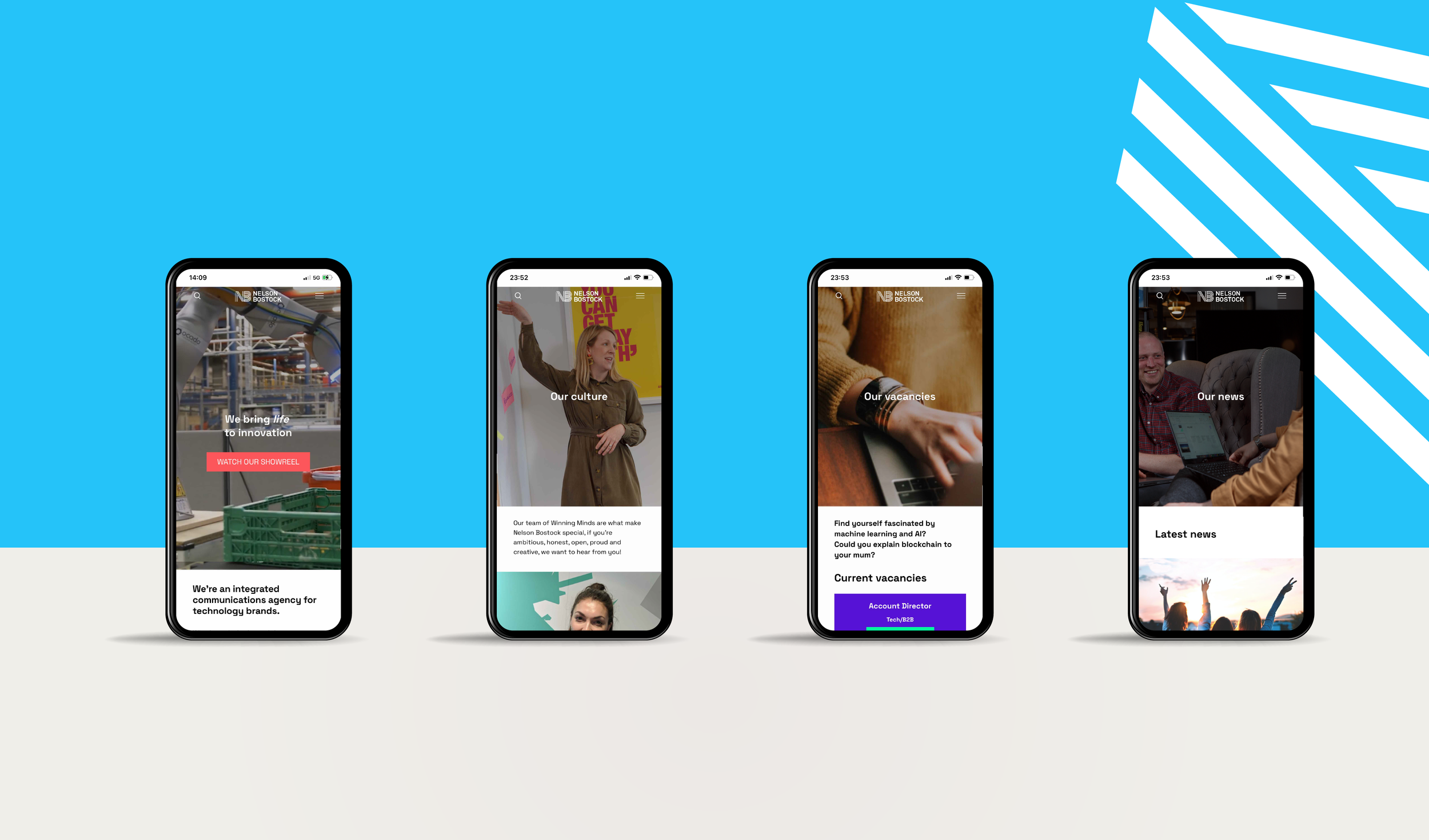
The layout of the interface was inspired by the dynamic angular shapes and bright colours of the NB brand guidelines. The angular shapes are crops taken from the Nelson Bostock logo. The goal of the new interface design was to appeal to prospective tech brands and attract prospective new joiners. Unlimited’s video production team created an impressive showreel for the homepage highlighting achievements from a range of clients.


HOMEPAGE SHOWREEL
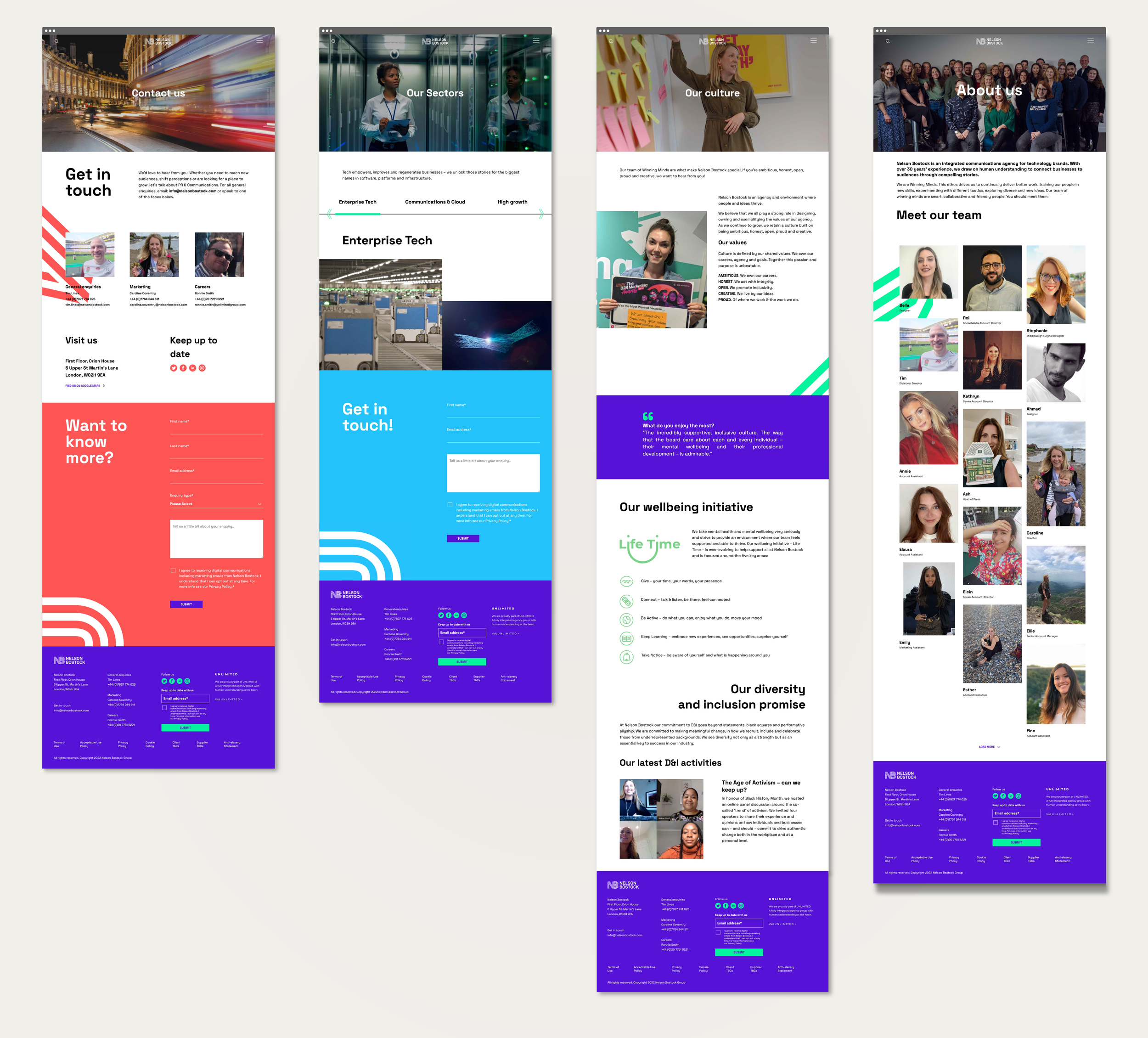
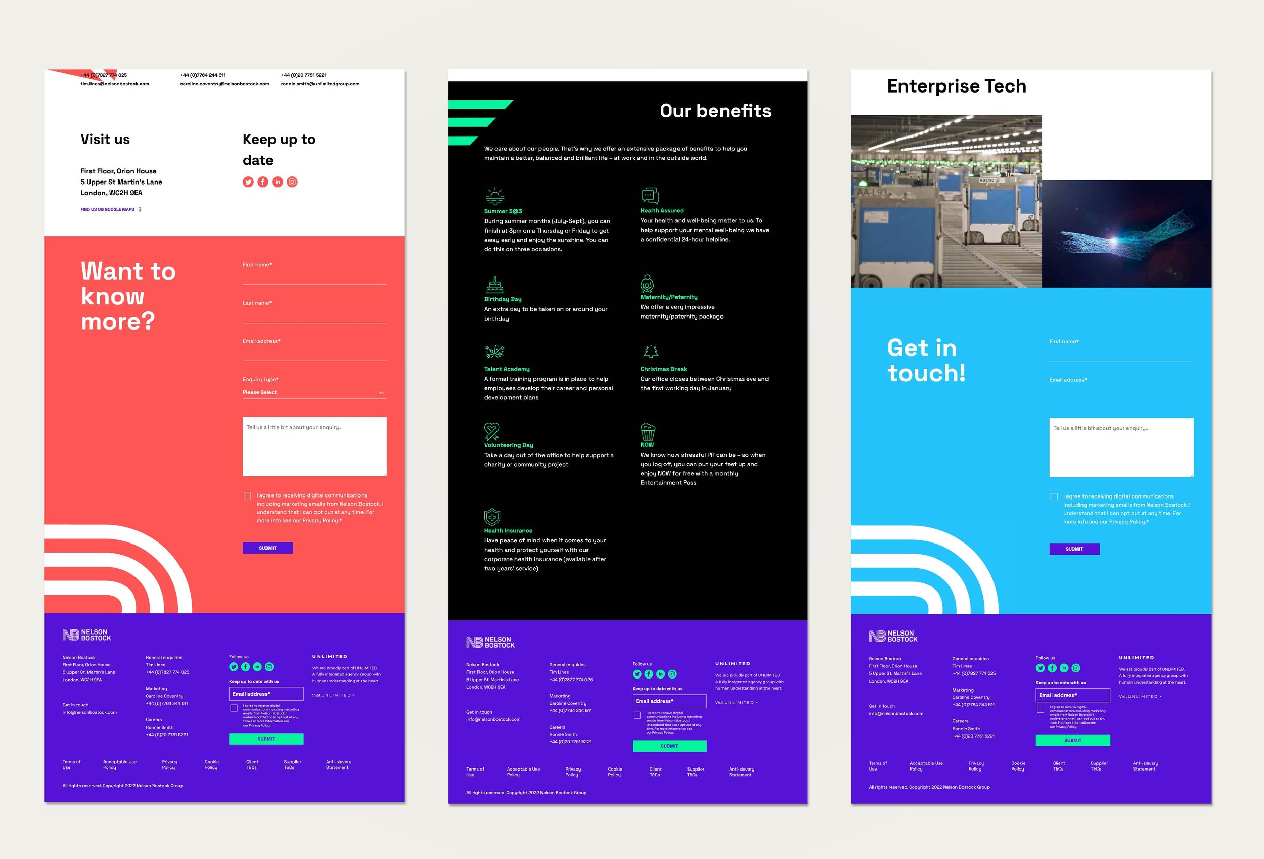
Case study pages utilised tagging functionality and a section at the bottom of each case study page featured similar case studies to enforce cross pollination.
The vacancies and team pages featured in depth employee case studies and benefits, according to Google Analytics the team and vacancies pages are the most clicked on pages every month. Hubspot tracking was incorporated on buttons and forms to collate user data.
THE OUTCOME
A full scale website aligning to the new brand look and feel and proposition. The new website was well received by clients and potential new business opportunities. Every month on average 1-4 new business opportunities are funneled through via the new website.